💡 Phase 02: Exploration
Narrowing down the target user: Educational, or "tech-bro" approach?
I knew that I wanted to make an immersive origami tutorial app— but for whom, and how? With my research I found that:
the impact on learning from origami is not any better than regular instruction, so it'd be hard to justify spending hundreds to thousands on headsets in an educational setting.
Ultimately, I decided to stray away from the idea of designing both the brand and the app around an educational perspective, but geared towards relaxation and creativity for older hobbyists, as they would have the adequate resources, time and motor skills to appropriately utilize this application.
📡 Phase 01: Discovery and Research
Meta VS Apple Vision Pro: Meta is built more for videogames, while Vision Pro is meant to be a lifestyle.
Since I was basing the app off of relaxation for more mature hobbyists, I found that Meta was made to be more of a gaming headset compared to the Vision Pro, which advertises itself as a new approach to productivity and lifestyle. Since this app was supposed to be instructional, I chose Vision Pro as my main application, the intention of this application was not to gameify origami but to rather make it more accessible and easier.
Key Design Principles: Influencing what features should be in the application.
🛋️ Comfortability
Since origami is seen as a relaxing activity, the user should be in physical comfort at all times whilst on the application.
Test the app’s color scheme and UI under a variety of lighting conditions
Design using a user's FOV while sitting down
Follow accessibility guideline s to ensure that everyone has an equal opportunity to enjoy origami.
👓 Simplicity
Through analyzing current origami tutorials, it was clear that a simple and clear journey for the user became key to integrate.
Make the interface as clean and intuitive as possible
Simplify the number of steps needed to reach the call-to-action
Reduce the number of obstructions (pausing, "scrubbing" along a video) needed to follow along a finished origami piece.
I first designed the app using the typical Vision Pro design system, using the standard materials, font, and colors. This is because I believed that a more familiar appearance would be more intuitive for users. But the more I researched, the more concerned I became that it may not be the best course of action.
Main concern: Lack of differentiation from other platforms.
Lack of differentiation from other Vision Pro applications— given the app is centered around a calming, creative activity like origami, a more distinct visual style is likely to stand out
Aesthetic-usability effect — users perceive aesthetically pleasing designs as easier to use. By differentiating my app with a unique visual identity, it creates an engaging and memorable experience, which research shows increases user satisfaction. (Reference: Kurosu, M., & Kashimura, K. (1995). Apparent Usability vs. Inherent Usability: Experimental Analysis on the Determinants of the Apparent Usability)
So, I designed for all options:


A) More familiar material; colorful (Default Vision Pro Material)
B) Monochrome material more aligned with brand identity and values of relaxation
C) Monochrome Icons
Key Takeaway: A vibrant color palette don't necessarily equate to chaos but rather, — familiarity, a unique source of relaxation.
After user testing, key feedback I received was:
"The colors in A are less bland and easier on the eye"
"A is more relaxing because the colors are familiar and cozy, which makes it relaxing."
"The monochrome icons are less recognizable."
Final UI Kit
As preferred by the users, the UI kit which Apple provided for their Vision Pro proved to be their favorite. One drawback to consider is that my sample pool only consisted of 6 individuals, with only two of them having actually used the Vision Pro. This means that the data not be necessarily concrete or solid proof that a larger user base may prefer version A.
Materials
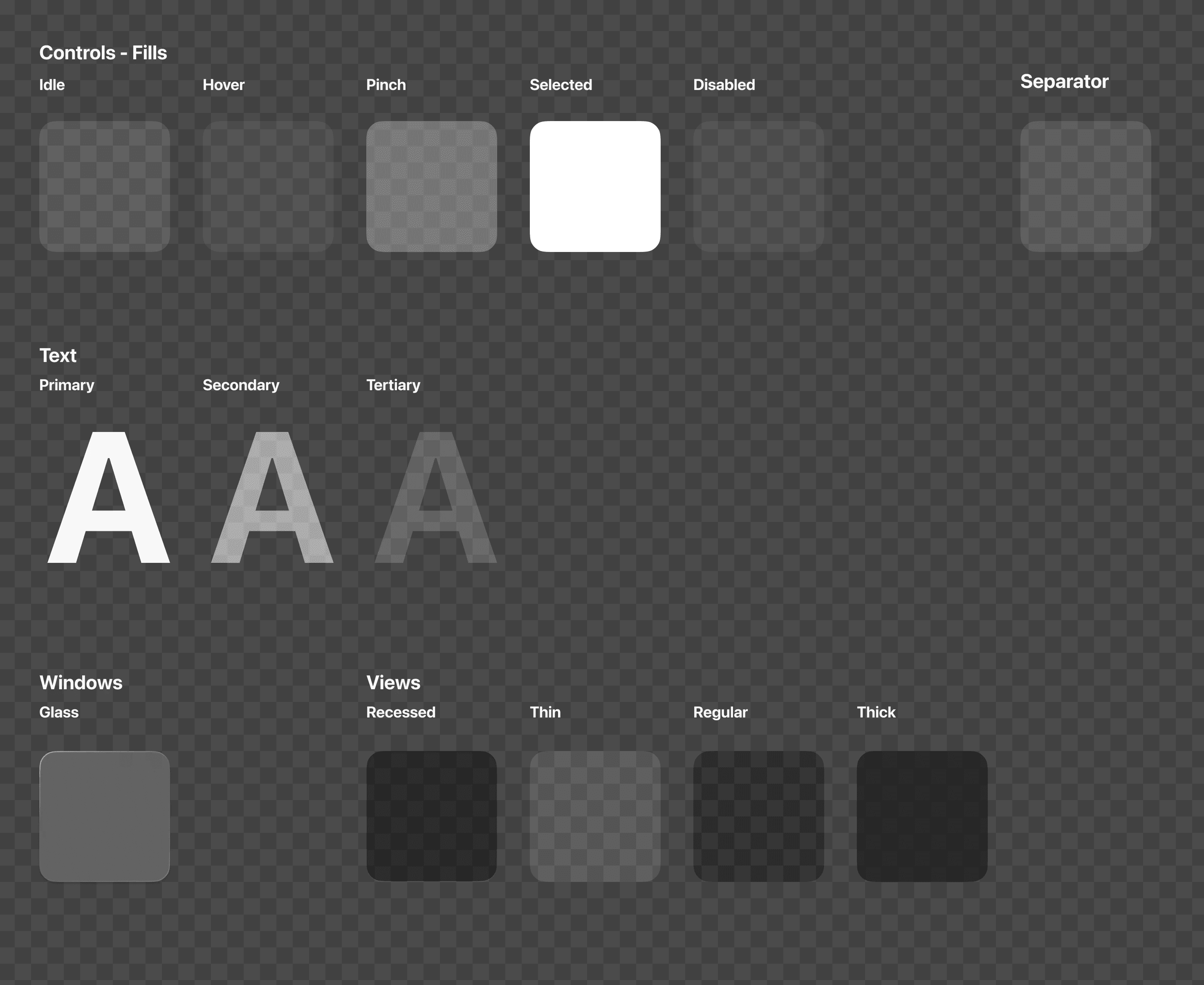
Components

📪 Final Prototype
📖 Choosing a tutorial
📘 Viewing your collection
🔎 Starting a tutorial
🌎 Environment Calibration
🤖 Immersive Tutorial
Finding the Best Interface: Hick's Law proved that less is more— reducing the cognitive load on users is pivotal in ensuring that the CTA is approachable and accessible.
I was conflicted between which Tutorial Overview page format would be more suitable after the user selects an origami figure, and how to format the CTA layout to be more effective in encouraging users to press "start."
Conflicts:
The top (A) is more compact, with the start button being more clearly centralized.
The bottom (B) however, is larger and simpler in content.
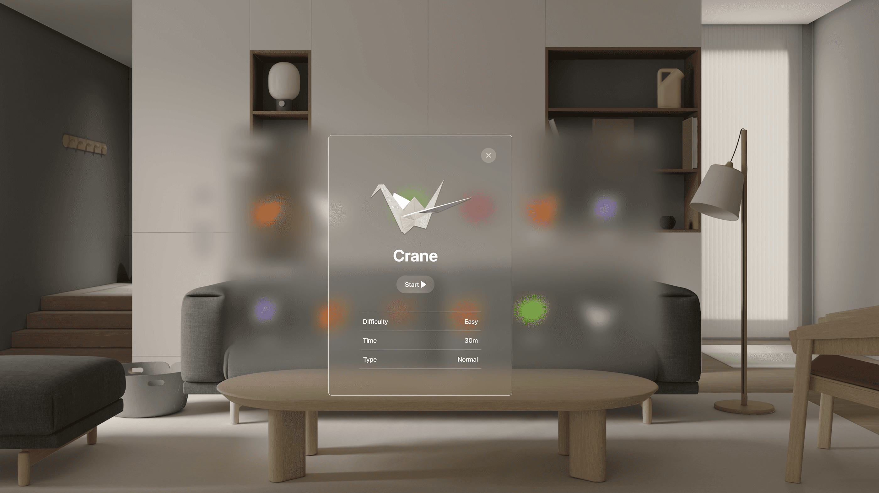

After user testing and research, I decided that B should be the final format. My goal with this application was to reduce as much cognitive load while immersing users as possible— and option B was a clear winner due to the lack of visual distractions.
The main focus in B is the tutorial which the user selects, while in A, it will take the user longer to select a decision due to the extra options visible in the background (Hick's Law). Less windows also equal to less cognitive load on the user. Not to mention, the start button in B is larger relative to the user's FOV, while the start button in A is smaller relative to its window. Because users use their eyes and fingers to select something, it would be easier to select the button.
🌄 Conclusion
Reflection:
Ultimately, designing in 3D gave me a stronger grasp of UI/UX design principles, especially when it came to interaction design. It reinforced the need for an intentional, user-centered approach, where every element and its connection served a purpose.
Next Steps:
Build a functional prototype for more in depth user testing
I'd'd like develop a functional AR prototype using Adobe Aero or Bezi within a business context to allow me to gather valuable user insights. Observing how users interact with the tutorials and create their origami will be key in this process!
Improving motion and interaction design
Animation helps to further immerse the users into the application.
The Mission?
To validate an immersive and intuitive origami tutorial experience for Apple Vision Pro, combining an intuitive step-by-step guidance with interactive elements that enhance learning and creativity. Our goal is to design a seamless interface that adapts to users' needs, ensuring every fold feels natural, and reminding users of the infinite possibilites, while keeping the experience both calming and engaging.
TLDR: To validate the usage of augmented reality and leverage Apple Vision Pro's spatial environment and 3D capabilities to make the origami process more intuitive, educational, and accessible.
The Solution:
Create a fully immersive origami tutorial app where users can interact with 3D models, receive real-time feedback, and use intuitive gestures to fold paper virtually!
Key features include:
Intuitive 3D Interaction (gesture controls, eye-tracking, etc.)
Real-time Feedback (error correction, guidance overlays)
Accessibility (for users with different visual or hearing abilities)
Relaxing, engaging digital environment!
The Problem:
Users interested in learning the art of origami may find traditional tutorials overwhelming or difficult to follow, especially when transitioning between complex folds and patterns. This is further complicated in digital formats, where step-by-step instructions can feel disjointed and lack the tactile guidance required. For a medium as intricate as origami, there is a lack of truly immersive and intuitive tutorial experiences that blend simplicity with creativity, especially for users with varying visual or auditory abilities.
TLDR: Traditional origami tutorials can be static, hard to follow, or too advanced for beginners.
🔖 Brief Overview:
JOANNA BUI